Poster Design
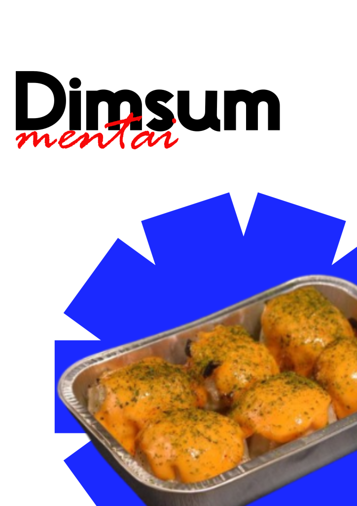
This poster features a clean, high-contrast layout that places the product name front and center. The word “Dimsum” appears in large, bold black lettering, while “mentai” cuts across it in a loose, red handwritten script, creating an immediate sense of energy and personality. The upper half of the design stays mostly white, giving the typography room to breathe and ensuring the title remains the first thing a viewer notices.
Below the text, a series of sharp, angular blue shapes rise from the bottom edge, forming an abstract geometric backdrop. These solid blocks of color add visual weight and a modern graphic quality without competing with the food. Nestled among the blue forms is a realistic photograph of the dimsum mentai arranged in a silver foil tray, the glossy orange sauce and light green garnish catching the light and drawing the eye toward the product itself.
The overall composition balances bold graphics with a clear product shot, making the poster both eye-catching and easy to read at a glance. The limited color palette of black, red, white, and vivid blue keeps the design cohesive and memorable, while the placement of the food image grounds the abstract elements in something tangible and appetizing.